Showing posts with label comparison. Show all posts

Wednesday, January 22, 2014

OPI: Push and Shove and Over & Over A-Gwen- swatches

*press samples* 

I have the last two polishes from OPI's Gwen Stefani collection for you. You can see the previous ones HERE. So today I have Push and Shove, Over and Over A-Gwen and a cute mani using 3 of the polishes from this awesome collection.

 First, here's a real simple mani you can do using Over & Over A-Gwen, 4 In The Morning and  Push & Shove. It's a little shiny rocker-chic with three different finishes. 4 In The Morning didn't really show as well over Push & Shove but it still looks leathery or rubbery so it works well. Plus, you can't go wrong with Push & Shove because it's pretty fantastic.
 The signature red hue of Gwen Stefani. This is such a cherry bomb color, I love it! Only thing I don't like about red polishes is the clean up is hard and it doesn't remove from the cuticle as easy. 


Push & Shove is amazing. This chrome\foil\metallic finish is breath taking. It literally looks like mercury on your nail. You start with Lay Down That Base (special base coat for this finish), and do two thin coats of color making sure that the first is dry or else you will get drag. No top coat necessary and it dries quickly so you're good to go soon after application. It's a big impact for little effort, love this!
As a quick comparison, Big Apple Red is super duper close to Over & Over A-Gwen but may be a bit darker. Very very hard to tell on the nail though, but the Gwen is much better in my opinion because you get the awesome bottle and packaging which includes a bunch of Swarovski studs for nail art! Worth it. :) 


This promotion will be available beginning January 2014 at Professional Salons, including Beauty Brands, Beauty First, Chatters, Dillard’s, JCPenney, Pure Beauty, Regis, Trade Secret, and ULTA, for  $9.00 ($10.95 CAN) suggested retail for each nail lacquer. The boxed set including Over & Over A-Gwen and SWAROVSKI ELEMENTS will retail for $14.95 ($18.95 CAN).
For more information, please call 800-341-9999 or visit www.opi.com. Follow OPI on Twitter @OPI_PRODUCTS and become a Facebook fan!


Wednesday, January 1, 2014

Sally Hansen: Triple Shine Swatches

Hi guys, remember my original press release about Sally Hansen's Triple Shine line?  Well, now I have a few to show you from that line and they're pretty great and even include a close dupe to a Lippmann and a shifter. Let's get to it...
 Oyster Bar is a metallic silver that applies great and has minimal streaking, I topped it with Sally Hansen's Triple Shine Top Coat (which is great by the way). I'm thinking this polish may be a great for stamping because it's pretty opaque. Vanity Flare is a medium purple creme- love this color and will be using it often. Sparks Fly is a glitter topper with a blue tinted base. The glitters look similar to DL Today Was A Fairytale, the base of SF is darker but it looks just as sparkly on the nail as the DL. I layerd it over Oyster Bar.
Make Waves is a shifter. I used two coats over my bare nail and while it will never be opaque, it changes completely when layered over black. It shifts from a yellow\green to a teal to blue, it's pretty great. Over black, you can see the copper\yellow\orange\green come through. Over white it didn't change much but may be over a dark navy it would be awesome as well.
I used their top coat over all of these and you can see the shine is amazing. The brush is also flat, round and tapered so it distributes polish better than a traditional brush and for wide nail beds, I like it. They have 29
new colors to the line and at $4.99, they are a steal.
You can find all their colors HERE from their site.

*press release*

Saturday, December 14, 2013

Flakies v. Flakies

My Winter Giveaway is HERE
 I have flakie spam for you today.  I haven't picked up Nfu Oh 51 since 2011, so I thought it needed some attention. I layered it over black. The flakies are pretty great: red, orange green to yellow. Kind of reminds me of fire on the nail. They light up like embers. 
I did one coat of 51 and that's plenty. The other flakie I have for you is Orly Fowl Play. I don't like this one as much. I started with 2 coats of Essie Baubbing for Baubles which is a super dark navy color. I added a matte top coat so they flakies would show better but alas, they didn't come out that much more. Fowl Play has blue and orange flakies in it, and I love the blue in this but that's about it. They are actually smaller than in 51 and I've decided, I like my flakies large and in charge. 


Friday, December 13, 2013

Essie: Toggle To The Top & Some winter nail art

Have I mentioned how hard it was to photograph Essie's Toggle To The Top? I haven't? well it is.
Leading Lady and Toggle are similar in idea but Toggle is much deeper.  I did a side by side of the bottles for you but my pictures are of toggle, 3 coats. It's a dark raspberry jelly with this pretty glitter that shines through in red. It seems pretty sparse though, hence the 3 coats so it looked more like a jelly sandwich. I then went all nuts and did some Christmas winter designs over it in white.. My freehand skills are not that great and not that steady.. but Toggle made for a good background.

Thursday, July 12, 2012

Chanel: Peridot v OPI: Just Spotted The Lizard

(pardon the spelling of Peridot as Paridot... damn, hate when that happens.)
Today's post is really straight forward: a comparison between OPI Just Spotted The Lizard and Chanel Peridot. On my index and middle fingers that is Chanel, on the ring and little that's OPI. So you can see they're super duper similar. Both are two coats with OPI having a little more visible nail line (a thicker coat would cure this or another thin coat). The main difference I noticed was taking the swatch off, the Chanel was harder to get off (in a good way) than the OPI. I did not do top coats for the pictures and it doesn't take me long to polish, snap shots then remove the polish so it was barely dry. The Chanel formula is just more thick and hearty than the OPI. Is it worth the high price tag in my opinion... no. Get the OPI. It's easier to find because you can enter my giveaway to win it :)

Monday, January 9, 2012

Comparisons: Holland v True (little something of each)

I swatched some colors for you on nail wheels as per request for more comparison swatches, especially from the new Zoya True and OPI Holland collections. I'll do an easy break down for you.

Blues: Skylar and Rotterdam are much more similar in person, I'd say one or the other but you don't need both, I like OPI's formula better.


Greens: Bevin and Thanks a Windmillion are practically the same in person, unless you compare them side by side in great light. Bevin is a little more smokey colored but really, I wouldn't need both of them.


Neutrals: Farah and Van Gogh are pretty close.  Farah has more yellow undertones in it. I'd choose just one (if you could pull off yellow undertones), OPI has better/easier coverage in my opinion for this one. If you already have Sand Tropez

Lotus is awesome and by far my favorite out of these three. It has pink shimmer and is a softer shade of purple from Neeka and less red than Mimue. Lotus is a must have.
(BTW Mimue is really Nimue)

Hope you all enjoyed this! Don't forget to enter my awesome 1000 follower giveaway :-)

Tuesday, August 16, 2011

Chanel Graphite v. Revlon Carbonite v. Sally Hansen Midnight Sky


Here's a comparison between Chanel Graphite and my picture of Revlon Carbonite. I was able to get a picture from Michele  (right) and Carly from Lacquered Lover who are Chanel fans :-)
In all three polishes you can see the shine factor is really close, Graphite is more of a silver tone (and upon close up you can see little green specks in  it, Carbonite I feel has more of gold under tones and Midnight Sky is obviously more charcoal. I think if you want/like the Chanel Graphite but don't want to pay the price tag that it comes with and are OK with a similar color/less expensive brand, I'd go Revlon. If you like the finish but wish Graphite was darker, I'd choose Midnight Sky. There you go, your comparisons :) Thanks again to Michele and Carly!


Saturday, June 25, 2011

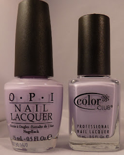
OPI: Rumples Wiggin' vs. Color Club Secret Rendezvous


As I was looking at purples for my gradient mani, I noticed I had two dupes.. OPI Rumples Wiggin' and Color Club Rendezvous! This is kind of great news because I love my RW and got a back up of it because it was from the limited edition Shrek Collection.  I like using this color when water marbling but it takes so much polish, so now I can use the Color Club.

The colors are for the most part identical but application is not. Rumples Wiggin' took 2 coats to opacity whereas Color Club took 3. Meh, no big deal.


The only other difference I noticed in my lightbox was that RW is a bit more on the blue side and R is more pink but seriously you cannot tell in real life.  Ok, so here's the reveal:


Index/middle: OPI
Ring/little: Color Club

Can you see a difference at all? This is great news for the purple lovers out there that cannot find Rumples Wiggin' or want to use this shade for marbling :-D

Enter My Giveaway!!!!

Monday, June 20, 2011

Rimmel: Purple Rain and Silver shatter/crackle comparison


This really is a purpley wine colored polish, I swear. It sort of looks more red wine than purple in pictures. Meet Rimmel Purple Rain. This was 2 coats with their gnarly flat brush that barely fits into the narrow bottle neck.  I actually like their brushes and will do a post on brushes but for now, let me re-focus.

Purple rain is a great creme with nice pigment and it applies well, opaque in 2 easy coats, no flooding.  It dries almost like a semi matte polish does, it's not overly glossy.  You can see from the close up that it looks squishy or almost like vinyl. 

The light from my light box looks diffused on the nail with no top coat.  It's a finish I really like with this polish color.  I wanted to do something different with this polish so I jazzed it up a bit by adding crackle and comparing it to shatter.

I thought it would only be fair to give my OPI Silver Shatter another try because we got off on the wrong foot last time.  So here it is compared with La Rosa Crackle (ring and little finger).  You can see that OPI  is much more glitter/foil than the La Rosa which is more shimmery. I like the effect of the OPI but I almost think all the foil in it takes away from whatever polish may be able to peek through the little shattered lines.  It is also chunky and thicker than any of the La Rosa crackles, which apply like a normal flat coat of lacquer.  I think that each is good for its own look and I actually do not have a preference because they are so different, but I do like an effect that lays flat on the nail without many thick coats of SV on top. I'm warming up to Silver Shatter so may be we'll be friends one day but for now, it's baby steps.

I have Rimmel polishes in my giveaway too! (I'm adding another item at 500)


Wednesday, April 6, 2011

Papaya Punch v. Sunny Side

One of my readers had asked for a comparison between China Glaze's Papaya Punch (from my swatching of  the new island escape summer collection) and Wet N' Wild's Sunny Side.  Ask and you shall receive.   :)


Here's a side by side in the bottles.. Orange is a bit hard to capture on camera under a day light bulb so feel free to click and enlarge the picture.


Left side is Sunny Side and on the right is Papaya Punch. 

Index and ring finger have Papaya Punch, middle and little have Sunny side on them. You can probably tell the difference in formula right away: China Glaze has that creamy fully opaque in two coats and the Wet N' Wild was a bit thinner with two coats. 


As far a color difference goes, The top finger in this picture (middle finger) is Sunny Side and below it is Papaya punch.  Papaya punch is more yellow toned and Sunny Side is clearly a red toned orange.  I favor the Papaya Punch more because I don't wear too many red toned polishes.  Even most of my purples are blue toned :)

Which do you prefer?